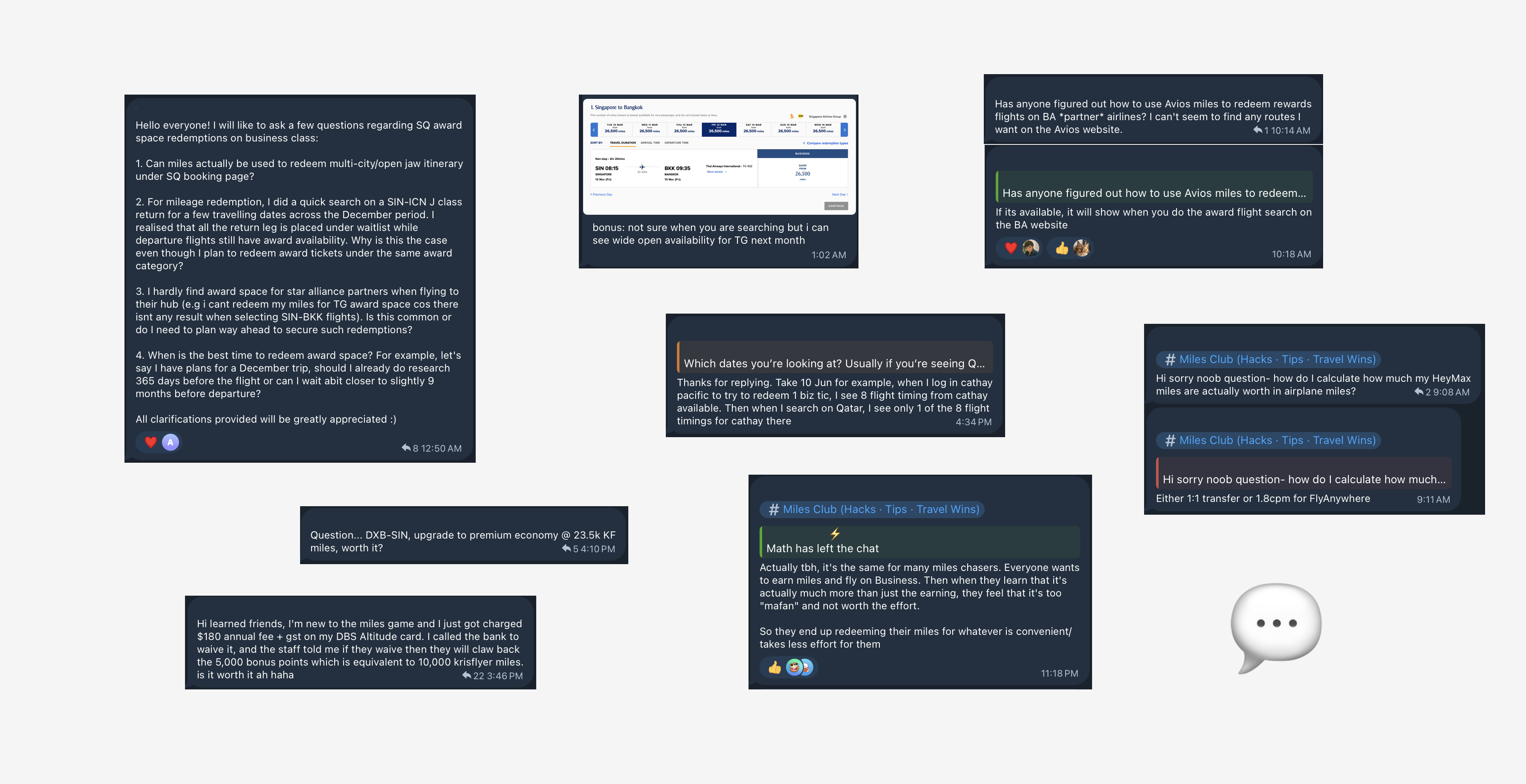
We looked closely at how our most active redeemers "power users" were interacting with the app. Across community chats and direct conversations, a consistent pattern emerged:
1. Redemption is difficult, even for experienced users. Many relied on multiple tools to verify availability and calculate value before booking.
2. New users struggle to understand the value of Max Miles. A common question was: “How much are my miles actually worth?”
The currency was abstract, making redemption intimidating.
These insights clarified that the issue wasn’t just “we need a search feature.” It was deeper: the platform didn’t make miles tangible, didn’t communicate value clearly, and created friction at the moment of decision.
Frequent travellers are highly disciplined about earning miles, yet surprisingly inefficient at redeeming them.
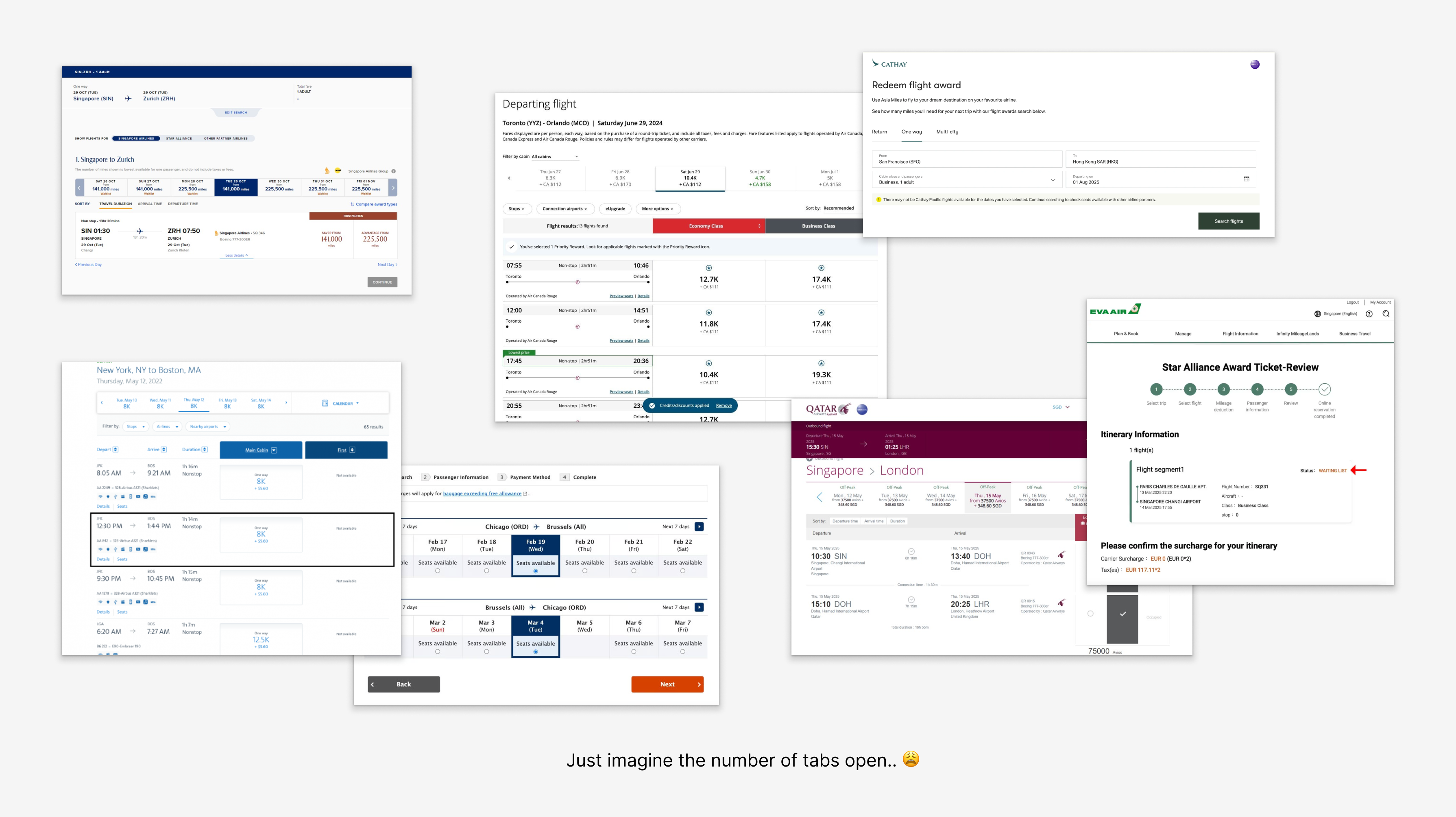
Booking an award flight typically means:
• Searching multiple airline and partner programmes
• Cross-checking availability across tabs
• Recalculating value manually
• Verifying flight availability across all programs and airlines
The process is fragmented, cognitively heavy, and often unreliable.
For HeyMax, this posed a strategic problem. If redemption requires leaving our platform, we remain a supporting tool. Not the primary decision environment.
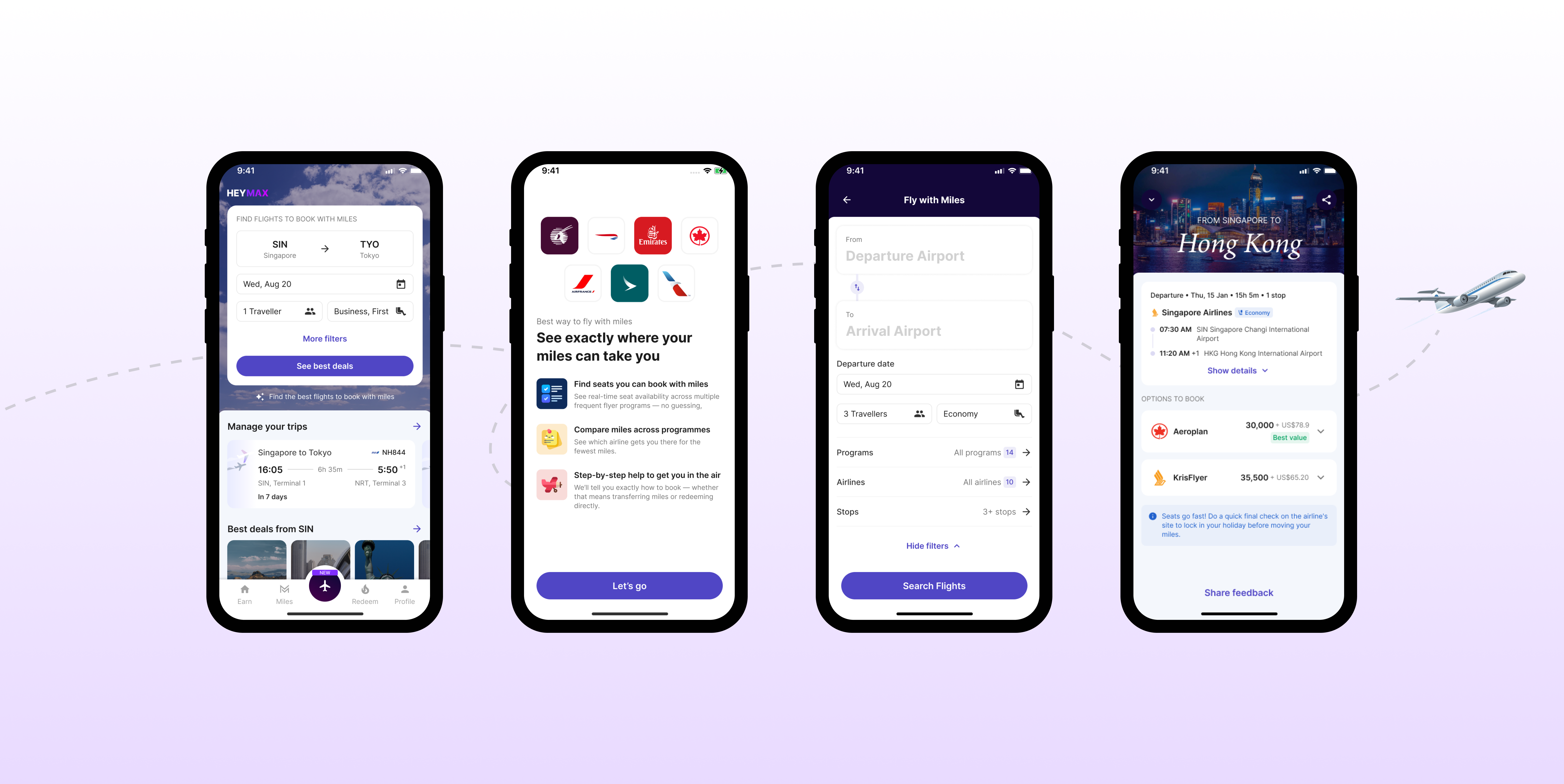
The goal was not to add features. It was to reduce effort, uncertainty, and decision time, and make the value of Max Miles instantly understandable.
We interviewed six experienced award travellers and tested prototypes with them to understand real decision behaviour. Several consistent patterns emerged:
1. Trust determines adoption. Users are willing to try new tools, but they verify results externally until reliability is proven.
2. Decisions are driven by a small set of factors: miles required, fees, timing, routing, and whether flights are direct.
3. Value is subjective. Some travellers calculate cents-per-mile precisely, while others rely on rough mental benchmarks and ignore formulaic scoring.
4. Flexibility is essential. People search across date ranges, regions, and alternate airports rather than fixed inputs, and most search for multiple seats at once.
5. Device behaviour differs. Desktop is preferred for comparison and booking, while mobile is used for casual exploration or inspiration.
These findings shifted the design definition of success: enabling confident decisions mattered more than maximising features or metrics.
Rather than replicating airline search interfaces, we focused on three principles:
1. Comparison over density
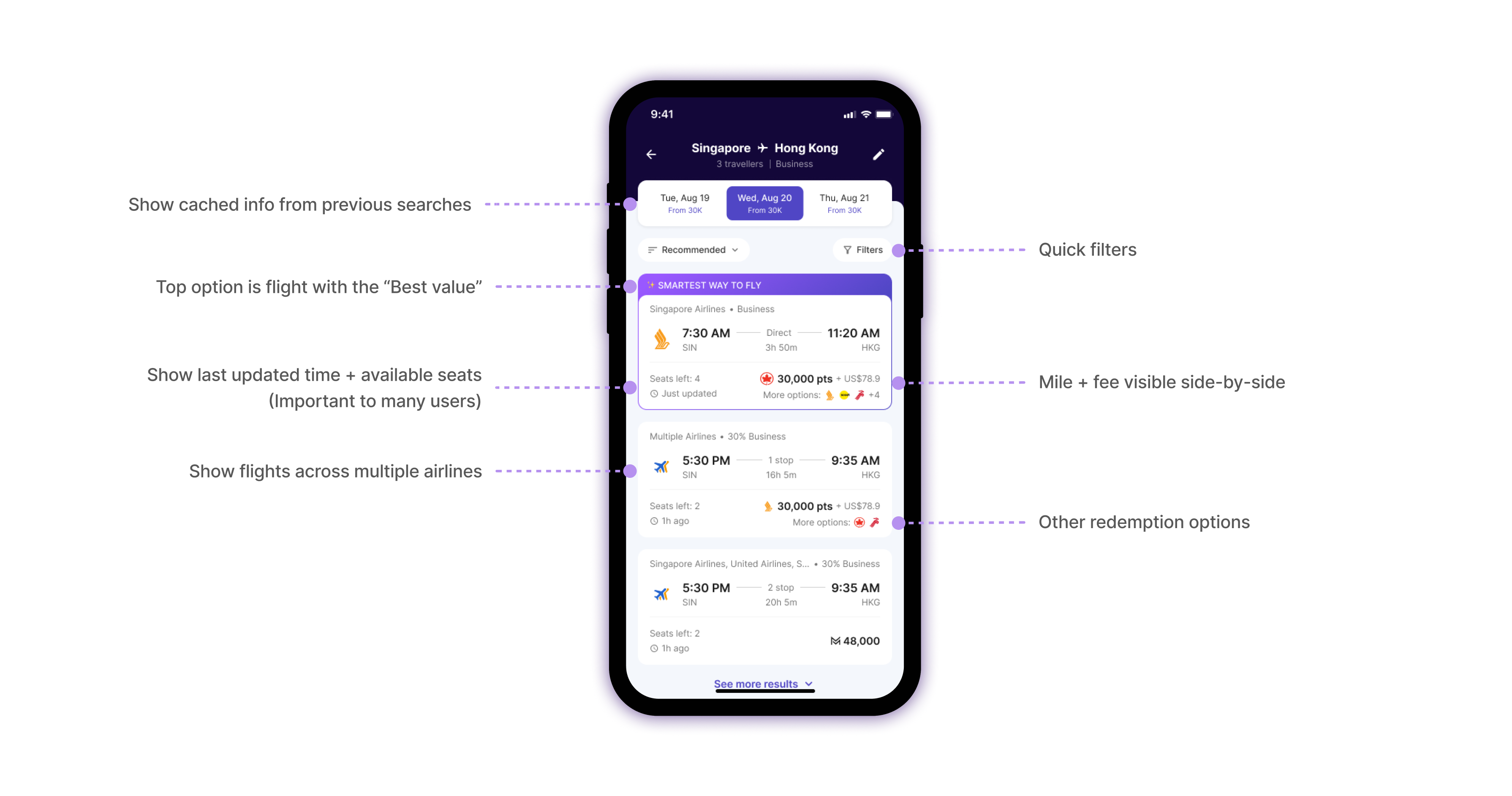
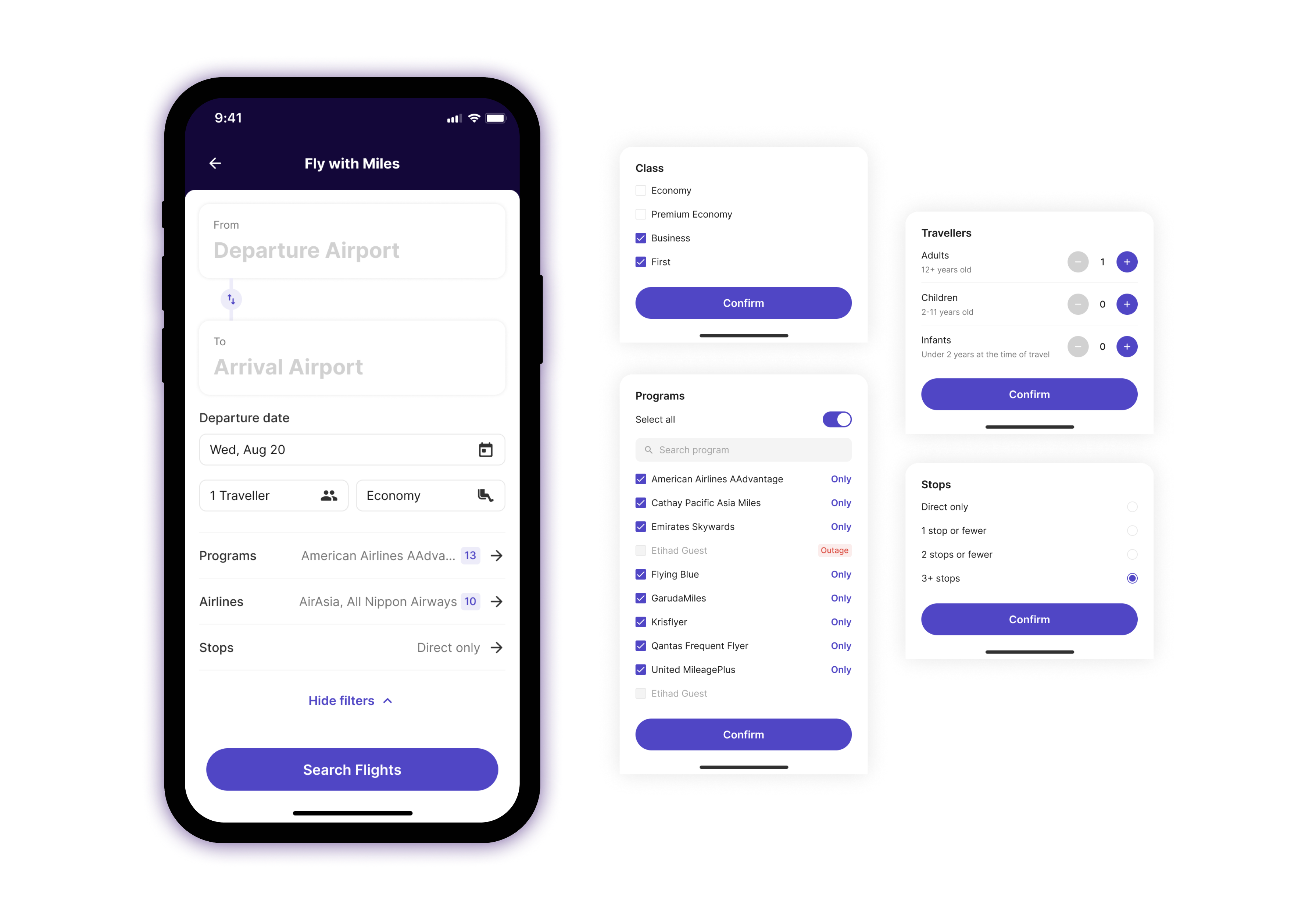
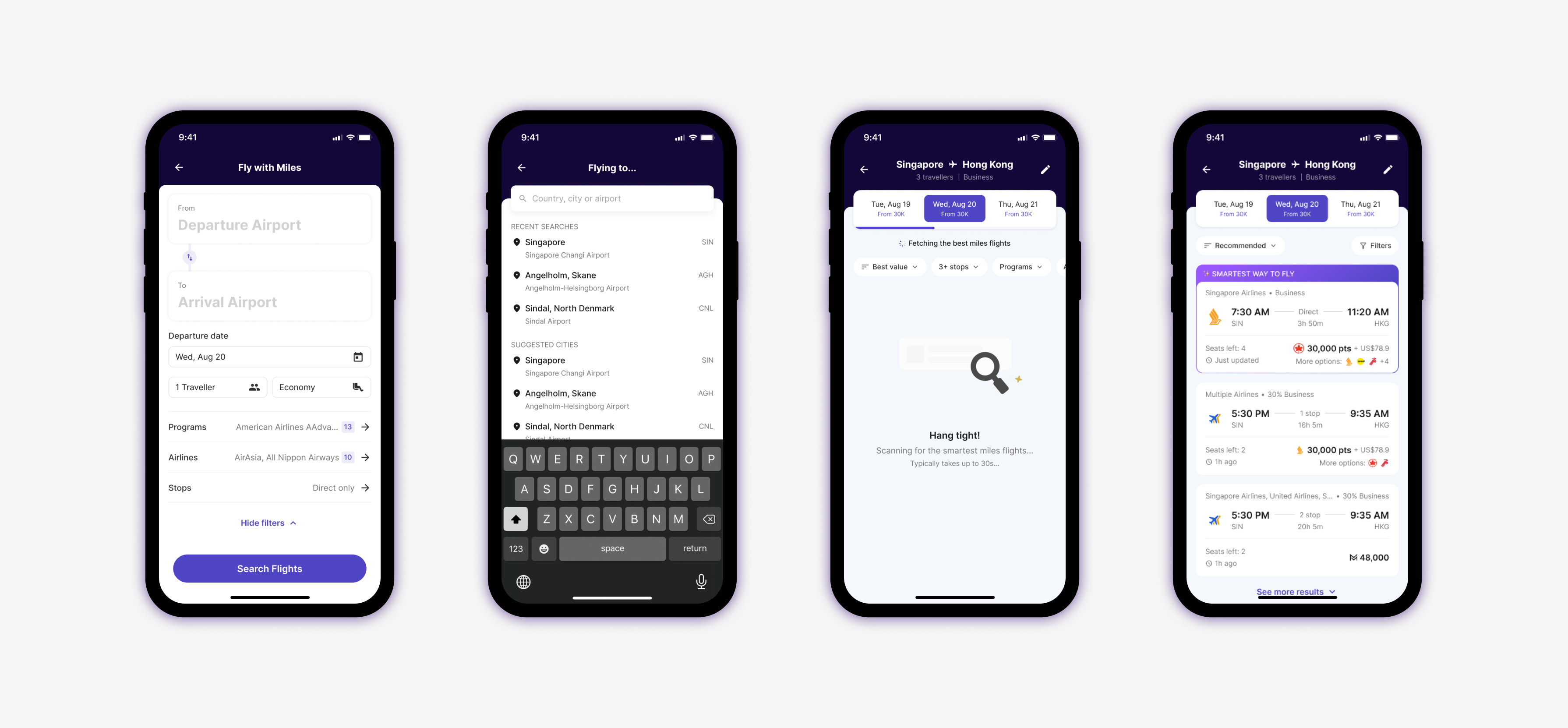
We aggregated multiple loyalty programmes into a single results layer optimised for side-by-side evaluation. The interface foregrounds what users actually use to decide — miles, fees, routing, seat availability — while secondary data like cents-per-mile supports context rather than dictating decisions.
2. Flexibility as a primary interaction
Filters, date ranges, and routing adjustments were elevated to first-class controls. This allowed exploratory search without forcing users to reset context, reflecting real-world decision patterns.
3. Transparency builds trust
We made value explicit. Metrics and Max Miles equivalents were displayed clearly, and users could see completeness indicators at a glance. This reduced cognitive load and reinforced confidence in the platform.
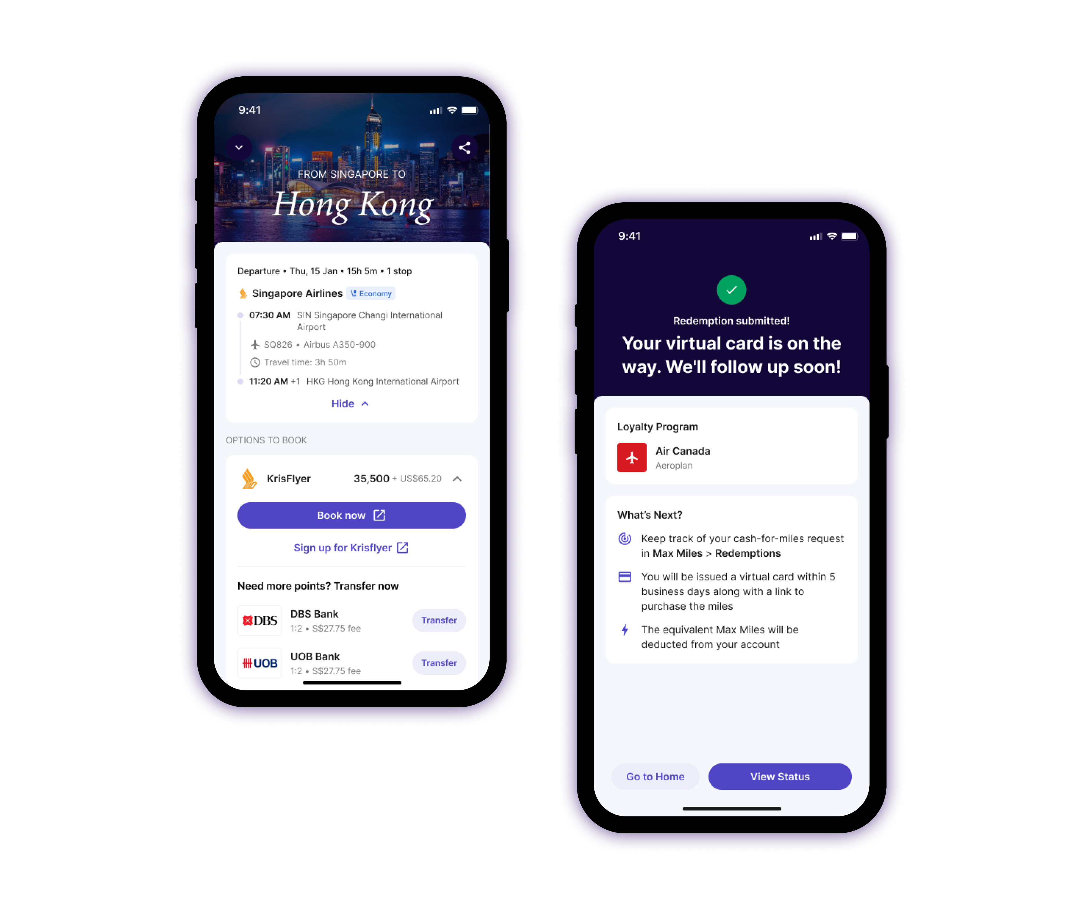
The experience also extends beyond search, supporting booking handoff and post-booking management, ensuring continuity throughout the redemption lifecycle.
Though the feature launched only last week, the initial traction demonstrates strong engagement and validates our assumptions about user behaviour:
Unique users: 3K
Searches conducted: 9.4K
Flight search conversion: 86%
Bookings completed: 5.7%
Weekly retention: 35%
Even in this early stage, users are actively exploring multiple options and completing bookings, showing that the unified interface reduces cognitive load and builds confidence in decision-making. These signals suggest the platform is on track to shift from being a supporting optimiser to a primary decision environment for award travel planning.
Flight search conversion
86%
Designing for complex ecosystems isn’t about adding more features. It’s about reducing ambiguity, structuring information clearly, and aligning with existing mental models. By making miles tangible and search effortless, we’ve already seen users engaging deeply, validating that clarity and trust drive behaviour.


 Back to Home